
Getty Images/iStockphoto
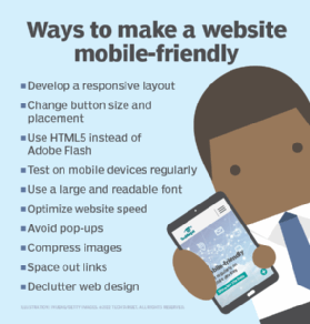
10 best practices to make a mobile-friendly website
By adopting practices such as building a responsive layout and decluttering design, you can improve mobile user experience and rank higher in search engines.

As people increasingly use their phones to search the internet, companies need to consider creating mobile-friendly websites to reach customers.
Having a mobile-friendly website is one way to improve your search engine ranking. One reason mobile-friendly websites are so important is that approximately 60% of internet traffic is from mobile devices, according to a report from Statcounter.
Being mobile-friendly means your website displays different versions depending on what devices visitors are using. Mobile devices have smaller screens than desktops, so a mobile-friendly website adjusts to give users a better viewing experience.
Desktop viewing not only provides a bigger screen, but also other programs and features that mobile devices might not have, such as Adobe Flash and pop-up screens. Mobile-friendly websites have features specific to mobile devices -- such as click to call and navigation -- and load in a timely manner.
Here are some best practices to ensure your website is mobile-friendly.
1. Develop a responsive layout
A responsive layout lets the website scale its size to fit the user's device. It can adapt to various screen sizes, displaying relevant content while changing design as needed -- such as moving from a two-column layout on a desktop to a one-column design on a mobile device. If it's a responsive design, it shouldn't affect the loading time when adapting to the screen size. You can choose a mobile-responsive theme when building or updating your site.
Having a responsive website can also improve search engine optimization, or SEO, because Google ranks websites that are mobile-friendly higher in search engine results. Google's algorithms use a mobile-rendered version of webpages instead of using desktop views when ranking sites.
E-commerce website builders such as Wix and Squarespace have mobile-responsive themes that can be customized. WordPress can also customize a website.
If you already have a website that does not perform well on mobile devices, try adding the viewport meta tag. By adding this tag, the website will scale correctly to different device screen sizes.
Add this code to the head tag on your website so that it scales correctly for different screen sizes.
<meta name="viewport" content="width=device-width, initial-scale=1.0">
2. Optimize website speed
Speed makes a big first impression on views. A website that loads in one second has a conversion rate three times higher than a site that loads in five seconds, according to a survey by Portent.
To check your website's loading time, visit BrowserStack SpeedLab. Enter your website's URL and select Get free report. This tool will verify your website speed and can display your score for both desktop and mobile viewing. The test must be run twice -- once for mobile and once for desktop.
One way to improve website speed is to host your videos on a third-party site and then embed them on your site. This way, your website won't feel the weight of these videos, which can affect your website's speed. Two popular video-hosting platforms include YouTube and Wistia.
Learn more about different types of marketing videos to reach customers.
3. Compress images
When adding images to your site, don't forget to compress images to limit the file size and help with downloading speed. When compressing images, the amount of data that needs to load for viewing is reduced, increasing the website speed. You can compress images using free tools, such as Kraken.io, to reduce the file size without sacrificing quality. Also, use proper image formats, such as JPEG 2000, JPEG XR, AVIF and WebP, which all result in smaller file sizes than JPEGs and PNGs of similar quality. Using those formats can help boost site speed.
Another option is lazy loading, in which images only load when needed. These images hover below the fold of the website -- or what the user can see without scrolling down. If the user scrolls down, then the images will load.
4. Use HTML5 instead of Adobe Flash
Adobe Flash is popular for animations; however, it is not supported by mobile devices. Avoid using Flash on your websites, and use HTML5 instead.
HTML5 lets you do many actions online without using browser plugins. You can embed movies and music as well as create animations using HTML5, which is supported by mobile devices.
5. Avoid pop-ups
Pop-ups work well on desktop versions of websites, but not on mobile devices.
Pop-ups are hard to view on smaller screens, and you can't trigger pop-ups at certain moments -- such as when a user exits your site or hits the Contact Us section. It can also be difficult for users to close out of pop-ups from a mobile screen because the X in the corner might not be visible.
6. Change button size and placement
If a button is too small or in the wrong spot on a mobile website, it can be difficult to use. Most mobile device users use their thumbs for navigation, so buttons should be large enough to hit with a thumb.
Users should also be able to hit any button on your website with their thumb when scrolling, meaning buttons should be located toward the bottom of the page.
7. Use a large and readable font
The recommended font size of at least 14 pixels for a desktop might not be large enough to be legible on a smaller screen. The best way to know if it's legible is to test it on a mobile device.
Don't experiment with new fonts, such as script-type fonts, on a mobile device because they might not be as easy to read. Try bolding different lines of text and stay consistent with the font style.
Use black for text instead of various colors. This helps users see when the background is a different color or if there are reflections, such as sun glare when viewing their device outside.
8. Space out links
Think about how hard it can be to accurately use your thumb to click a link as opposed to using a mouse. To help people click the link they want, space out your links.
It's also best to limit the number of links to avoid a sea of blue, and limit the number of redirections that take users to another site for a better user experience on a mobile device. If you have a link that takes users to another site, make visitors aware that they are leaving your site, such as, "Click here to see Company XYZ's new website."
9. Declutter web design
Don't clutter a website by adding multiple calls to action on one page. If there are too many actions for users to take, it can be difficult to navigate on a smaller screen and cause confusion. Use only the critical functions the users would actively look for, such as the contact form.
Make sure the design is simple so that the navigation is easy to understand. Use white space so that users can see everything at a glance and keep content organized. Also, remove any outdated content so that it doesn't take up unnecessary space or confuse users.
For menus, avoid long lists of options and features. A menu with all available navigation options might seem straightforward, but it takes up a large amount of screen space, especially on smaller screens. Instead, try using a hamburger menu -- a button that opens a longer menu. It will save space and create less clutter.
10. Test the website on mobile devices regularly
To make sure your website is mobile-friendly, there are multiple ways to test. First, test websites on mobile devices for user experience. Be sure to test using both Android and iOS devices.
You can also run the website through Google's Mobile-Friendly Test, which is free to use. You can test each page.
Don't forget to test often, especially after any website updates.