RGB (red, green and blue)
What is RGB (red, green and blue)?
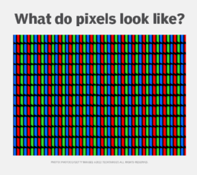
RGB (red, green and blue) refers to a system representing the colors used on a digital display screen. Red, green and blue can be combined in various proportions to obtain any color in the visible spectrum.
The RGB model uses 8 bits each -- from 0 to 23 -- for red, green and blue colors. Each color also has values ranging from 0 to 255. This translates into millions of colors -- 16,777,216 possible colors to be precise.
What is RGB used for?

This color space is a color representation method used in electronic displays, like televisions, computer monitors, digital cameras and various types of lighting. Before the electronic age, there was no such thing as an electronic display, so the RGB color model didn't exist.
To create a color model, scientists needed a way to represent colors electronically. They came up with three components: red, green and blue. These components were chosen because humans could see them easily.
What is an RGB signal?
An RGB signal is a video signal representing the television's primary colors -- red, green and blue. Often called a component video signal, RGB signals are divided into their component colors.
What is the RGB range?
Each component can take any value between 0 (black) and 1 (white). For example, if each component takes a value between 0 and 1, the total range of possible colors is 0 to 255. When these three numbers are added together, the resulting number represents the light's intensity.
Each R, G and B level can range from 0% to 100% full intensity. Each level is represented by the range of decimal numbers from 0 to 255 -- 256 levels for each color -- equivalent to the range of binary numbers from 00000000 to 11111111 or hexadecimal 00 to FF. The total number of available colors is 256 x 256 x 256 or 16,777,216.
Can we use RGB in HTML?
In Hypertext Markup Language (HTML), we can specify colors using RGB; hue, saturation, lightness; HSLA, which is an extension of HSL with an Alpha channel (opacity); RGBA, which is RGB with an Alpha channel; and Hex values. Hex values are now the industry standard. To display the colors for all possible values, the computer display system must have 24 bits to describe the color in each pixel. An approximation of the specified color is displayed in display systems or modes with fewer bits for displaying colors.
What is RGB lighting?
RGB lighting creates a wide variety of colors that range from warm orange to cool blue. RGB lighting technology is often used in RGB light-emitting diode strips -- for example, triple diode Classic LED strips.
What is an RGB keyboard?
An RGB keyboard is an advanced keyboard with an LED backlight that generates custom colors. Like a TV, it can create millions of potential hues by simultaneously combining red, green and blue light.
Screen colors and health issues
The capability to deliver stunning colors is a benefit of today's computers and other electronic systems, but eye strain has become a workplace health issue.
Blue light from screens can create fatigue and disrupt sleep. Employees can combat this by wearing special glasses or using free programs to adjust computer screen lighting. Digital wellness, encompassing eye strain and other workplace health issues, has become an important consideration in a positive employee experience.
In addition, legal requirements for accessibility are intended to ensure that a disabled person can access and benefit from a site, system or application. One consideration is color contrast, which impacts the readability of content on websites or other online systems. Sufficient contrast is important for users with no or limited vision.
Learn about hue, saturation and brightness, as well as pixels, the basic unit of programmable color in displays and computer images.
