hamburger icon (slide drawer navigation)
What is a hamburger icon (slide drawer navigation)?
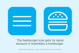
A hamburger icon (slide drawer navigation) is a navigational symbol in user interface (UI) design. It consists of three stacked horizontal lines that indicate the presence and location of a hidden menu. The icon got its name because its structure resembles a hamburger -- a patty in the middle of two pieces of a bun -- in a simplified graphic format.
A hamburger icon is a navigational tool whose purpose is to hide a menu and reveal it when a user clicks, taps or touches the icon. At that point, the hidden menu slides out from the side of the screen, presenting a set of options for future action. These options may include additional pages and features that are not visible on the screen at first glance.

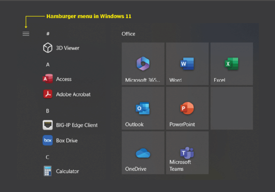
The icon is also known as a menu icon, slide drawer icon or slide drawer navigation. It can be positioned in the top left or top right of the computer screen or mobile device. In a start or end navigation bar, a hamburger icon or button is displayed either on the left or right of the UI. The button is most common in small devices, such as mobile phones or smartphones, where it is used to toggle side navigation. The icon is often located on the left and at the start of the viewport. It can also be at the end of the viewport, usually on the left side. However, it can be placed on the right side by changing the code.
Hamburger icon and progressive disclosure
The use of a hamburger icon illustrates an important principle in UI and user experience (UX) design called progressive disclosure. Progressive disclosure refers to sequencing information and actions across multiple screens to help users easily navigate complex or feature-rich applications or websites.

A key goal of progressive disclosure in website and mobile app design is to free up valuable screen real estate by only showing information that is relevant to the end user's immediate activity. Additional information and features can be accessed upon request as the user navigates the website or app.
The hamburger symbol also contributes to responsive design for websites and mobile apps. This design approach creates UI and UX that respond to user behaviors depending on the screen size, underlying platform and device orientation.
History of the hamburger icon
Norm Cox, a former graphic designer at Xerox, created the hamburger icon as part of the UI for a computer workstation called the Xerox Star. The workstation, released in 1981 and promoted as an office automation system, featured a groundbreaking graphical UI that used images of familiar office objects, like file folders and trash cans, to represent tasks.
The desktop metaphor was quickly adopted by other computer vendors and is still used today. However, the hamburger menu fell off the radar for several years but reappeared in 2008 in the Twitter app called Tweetie. Since 2008, many digital applications and websites, including Facebook, Gmail and Mozilla Firefox, adopted the icon as part of their UI and UX designs.

The benefits of the hamburger icon
The main benefit of the hamburger icon is that it gives the app or website a clean, clutter-free look. The simplicity of the icon enables users to easily interact with an application rather than be overwhelmed by its many features.
Another benefit of the icon is that it takes up little real estate on the screen and is unobtrusive. This enables users to focus on the most important parts of the site or app when they first interact with it, instead of having to navigate through many pages and navigation elements to access what they need. The hamburger icon helps reduce user fatigue, which is common with feature-rich apps and cluttered UIs.
Debates about the cons of the hamburger icon
While the hamburger icon has been around for decades, its learnability design principle is often a subject of debate among digital UX professionals. The learnability design principle addresses the ease with which users can accomplish basic tasks the first time they encounter a design.
Proponents of the hamburger maintain that most users are familiar with the icon, and as computing becomes more mobile, the icon will continue to play an important role in providing a natural UI, simply because the available screen space on mobile devices is limited.
However, detractors maintain that hiding navigation options behind the icon and lack of visibility result in users forgetting them. These detractors often prefer a tabbed or tiled approach to navigation.
Another criticism of the hamburger menu is that it doesn't showcase an app's features or communicate their value, especially to new users. This result in a high number of users leaving or deleting the app. Other disadvantages of the icon are the following:
- The placement of the icon in the top left of the screen implies that it's not important, resulting in low click rates.
- The button can be hard to reach or interact with, especially on smaller devices.
- The icon can clash with other icons or buttons, affecting app usability and UX.
Explore 10 best practices to make a mobile-friendly website, and see five digital customer experience trends for businesses to consider.
