death by PowerPoint
What is death by PowerPoint?
Death by PowerPoint is a phenomenon caused by the poor use of presentation software. It occurs when a seller or speaker fails to capture an audience's focus and interest using their presentation.
Factors that can cause death by PowerPoint include overly wordy slides, hard-to-understand graphics or a speaker monotonously reading off their PowerPoint slides. For example, death by PowerPoint can occur when a sales presentation fails to engage a customer.
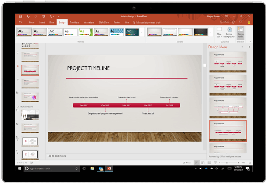
For some organizations, Microsoft PowerPoint and other software, including Canva and Apple Keynote, might be essential presentation tools, so it's important to know how to properly engage an audience in a presentation and not lose them in an onslaught of unfocused slides.

What can go wrong with PowerPoint presentations?
Death by PowerPoint can be easily recognized by observing the audience members' glazed eyes, furtive use of smartphones and excessive number of trips to the restroom. Key contributors to death by PowerPoint include the following:
- Too wordy. Slides with too much text can cause the audience to tune out the speaker, as they either read the slides ahead of the speaker or stop paying attention entirely.
- Confusing graphics. Even though graphics can be effective, images that are distracting or poorly designed can cause the audience to spend more time trying to understand the graphic than listening to the speaker.
- Too long. Presenters whose idea of a good presentation is to read 40 slides aloud might quickly lose their audience, especially when what they say can be said succinctly.
- Lack of focus. When an audience remains emotionally disconnected from the presented content, there's a good chance the speaker hasn't devoted enough time or effort to considering which key points they want the audience to take away. Generic presentations can also cause the audience to disengage with the speaker.
- Too many bells and whistles. It's easy for a presenter to lose the audience's attention when they spend too much time and effort setting up their presentation in PowerPoint, incorporating every feature and display option the software provides.
- No contrast. Slides might be hard to understand if the text lacks contrast -- like light-colored text over a white background or dark-colored text on a dark background. Poorly designed slides with text or graphics everywhere are also distracting and make the slides look cluttered.
- Too technical for the audience. A speaker might lose their audience quickly if their slides are too technical for the audience to understand. Technical diction and lengthy explanations might discourage the audience.
- Monotone delivery. Reading directly off the slides in a monotone voice quickly bores audiences. Speakers need to expand on their slides and incorporate information that complements what's shown.
- Abrupt endings. When a presenter abruptly ends their presentation without providing a conclusion, it can take the audience by surprise. New information shouldn't be brought up during a conclusion. The presenter's focus should be on giving a summarized conclusion.
Ways to avoid death by PowerPoint
Presenters can avoid death by PowerPoint by following these tips:
- Use PowerPoint to enhance the presentation. The presenter should rely on the technology as a visual aid to enhance what's being said, instead of relying on the software to serve as the focus of the presentation.
- Prepare for the presentation. Research the audience's background beforehand, including their interests and what type of information would engage them.
- Tell a compelling story. Even though it isn't needed, a story can engage the audience while conveying an idea.
- Create easy-to-understand and aesthetically pleasing slides. Aside from not boring the audience, keeping all the information on slides organized helps an audience follow along with the presentation.
- Make the slides complement the speaker's presentation. The PowerPoint presentation should support the key points or ideas the speaker is conveying.
- Don't include too many ideas on one slide. Multiple main ideas on one slide can divert the audience's attention.
- Use contrast. Contrasting colors can help steer attention from one point on a slide to the next.
- Use the text on a slide as a starting point. Don't read off the slide word for word. This prevents the audience from reading ahead. Making the text into bullet points can help shorten the amount of text on the slides, while also providing the presenter with speaking points.
- Engage the audience with multimedia formats. Including audio or video on a slide helps audio and visual learners.
- Use props. Props, including handouts, should help engage audiences; however, information on those handouts should be kept brief.
Learn about some more tips for delivering a successful presentation.
