Years of customer relationship building, brand management and creative strategy are just no match for the use of goofy cartoons, people icons that oddly have no faces and nonspecific renditions of technology and business concepts. We all agree, but for some reason all of our companies’ decks are chock full of clipart. The era of DIY makes it so easy. What’s a brand advocate to do?
Prepare to hear rationalization from your company’s clipart enthusiasts
- “Inserting clip art is a feature built into Microsoft PowerPoint, and Microsoft has to be the foremost expert on how to make PowerPoint slides, so how could it be wrong?”
- “One of the smartest and most successful companies ever, Google, lets millions of people every day find and use clipart and pictures easily. How could that be wrong?”
- “I had to use something, and it’s just on this one slide, so what’s the big deal? You are totally overreacting.”
The last one seems to have clear logic and can be difficult to dispute: you can’t be perfect in relationships, and one silly or awkward moment isn’t going to eat away at a customer’s trust that has been built over hundreds of positive touch points. So you and I are definitely overreacting. Or are we?
Challenge the logic that we marketers are overreacting
Using clip art is like passing gas in a business meeting
The first step to curbing the use of clip art is to convince your company’s offenders that it’s not just an insignificant, forgettable moment in a brand relationship with a client. If that sales person passes gas during a client meeting, no one on the client side of the table will stand up and shout “HEY YOU! WE DON’T WANT YOUR SOLUTION! GET OUT!” The client would simply ignore it and bear through it, because it’s polite business etiquette. But that doesn’t mean it’s an event without consequence that people will soon forget.
Your salesperson (and brand) will forever have to work harder with that customer to move beyond that slight negative perception of you in order to win deals.
Clipart is not as harmless as you think it is

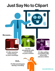
Here are a few other analogous situations we’ve come up with. You can ask your sales force these questions to show that use of clipart isn’t as harmless as they might think it is:
- Would you wear a crisp business suit while sporting enormous red clown shoes when you meet with a customer? Because that’s what using clipart is like.
- Would you go to client meeting with a spaghetti sauce stain on your tie? Because that’s what using clipart is like.
- Would you engage in very intelligent pitch with clients, yet yell “HOO, HAH, BING, BANG, BONG! “ when advancing to every fifth slide in the deck? Because that’s what using clipart is like.
We’ve prepared this (tongue-in-cheek) handout for you to use with your sales people to start the conversation. But you can’t stop there.
How to curb the stench of unpleasant visuals
You can’t just complain and convince in order to reduce the amount of clipart in your client communications. You need to provide alternatives. Often I’ve seen brands with great guidelines and vast libraries of consistent visuals, but access to the visuals and an understanding of how to use them properly can be difficult for the daily PowerPoint user. Using the right brand visuals is easily trumped by images instantly useable via a Google image search.
To solve the problem, we at TechTarget built a deck full of icons and visuals that are commonly used that included best practices. Our MIS team pushed the deck out to all of TechTarget’s Office users so it would appear in the MY TEMPLATES section of the PowerPoint interface on everyone’s desktop. No more effort to hunt down what’s available; it’s right there at everyone’s fingertips.
We also pushed out many resources to elevate the appearance and brand adherence of presentations:
- A deck with icons in different colors and sizes
- A deck with purchased stock photography that is relevant to our customer communications
- A deck with several different tables and text boxes to use as templates, already formatted to match brand guidelines
- A deck with several charts and graph options, where a user only needs to update the data in order to produce them consistently with the right colors and formatting
We’ve seen a dramatic decrease in the number of off-brand visuals. But the job isn’t done. We’ve learned we have to consistently add to the library to keep it fresh, and keep reminding people that clipart is not in anyone’s best interest.
If anyone has attacked this issue using inventive methods, I’d love to hear from you. Feel free to leave a comment below or connect with me on LinkedIn.


