Design huddle rooms to mirror team collaboration workflows
Different teams conduct different types of meetings. As a result, small conference rooms should be customized to accommodate specific collaboration workflows.
The huddle room craze continues to roll on.
For quite some time, huddle rooms have been more than mere marketing buzz. Small, medium and massive enterprises are seeing value and ROI from enabling spaces for quick working sessions. Collaboration vendors have been rushing to get their products and services into these spaces. But with all this noise, I still get asked a basic question: What does a huddle room look like?
Oftentimes, organizations want simple, one-size-fits-all services for huddle rooms. This setup would support the quick and easy deployment of hundreds or even thousands of room services. From a vendor's perspective, the holy grail of collaboration offerings would be the one-size-fits-all huddle room kit. Unfortunately, the nature of the huddle experience makes this impossible.
A perfect huddle room meets the specific needs of the working teams that use the particular space in question.
Team first, space second
The beauty of the huddle room is it's the first workspace where team comes first and space comes second. In other words, many executive boardrooms typically match a certain template in terms of size, tables, seats and audio-visual (AV) equipment. To build a boardroom, you start with the room template, build the room, and train users on its features and equipment.
With huddle rooms, you take the opposite approach. You start with the workflow and build a room to support it. If you asked me to describe the typical huddle room, I would first ask you to describe the team that will use the space.
For instance, is it a six-person app development team, with a leader who likes to do standup meetings? Is it a four-person sales team that likes to do roundtable customer updates? Is it a seven-person marketing team, with five people calling in remotely who need to draw in a virtual workspace? Clearly, these questions are vital, because you would not design the same workspace for these different teams.
With this in mind, huddle rooms still have some common elements, but whether each element is necessary depends on the team. If a team only does sit-down meetings, it does not need a wall-mounted whiteboard. If every team member is always on site, then remote collaboration tools may not be necessary.

Common elements among huddle rooms
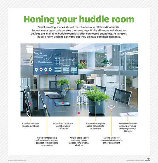
Arguably, the only essential elements for every huddle space are comfortable chairs, Wi-Fi and easy access to power to charge personal devices. Every other element is dependent on the workflow of the group. However, many huddle rooms could have some common elements, including the following:
Remote collaboration. The current trend is to embrace and embolden remote work. As a result, many huddle room sessions include remote workers. You don't want them just listening to the meeting. You want them fully engaged and productive, which requires video conferencing and remote access to any in-room collaboration tools. This level of engagement is addressed through new software video services and affordable hardware kits.
Local screen sharing. With the help of the cloud, users routinely have their work files with them on their personal devices. If users want to share these files with their team, a variety of wireless screen-sharing services are available. Some video conferencing services also offer local screen-sharing options. These tools let anyone in the room put their content on the big screen, so the entire team can work on it.
Standup meeting support. While not every team has standup meetings, they are becoming more popular. The typical Agile-Scrum meeting has team members stand up and provide a quick update on their work. These meetings could be enhanced by the right tools to help share information with the group. For some teams, a simple dry-erase board is all that is needed, while others may get massive ROI from a large touchscreen with custom software.
Basic amenities and comfort. Today's workers have different kinds of meetings. Every meeting is not a simple status callout or a leader-driven presentation. Now, teams have actual working sessions. If you want people to work productively, they must be comfortable and have the essentials. Good Wi-Fi for their personal devices and any equipment in the room is a must. The space itself should be pleasant -- somewhere working teams won't mind spending time.
Usability. Often, collaboration equipment goes unused, because it's too complicated or intimidating for the typical office user. Huddle rooms are meant to be used. The AV equipment should not be reserved for the AV people. Everything should be user-friendly. Ideally, apps on personal devices or touch panels should control everything. Confusing remote controls should not be necessary.
Users should be able to launch video meetings by touching a single button. Automatic pairing of devices should support local screen sharing. The room should not have any confusing technology that requires extensive user training. Conference rooms are not premium spaces in which a few lucky teams get trained on the technology. These spaces should accommodate all working teams.
What does your workflow look like?
At the end of the day, your huddle room should be a physical manifestation of your team's workflow. To ask, "What does a typical huddle room look like?" is the same as asking, "What does a working team's typical workflow look like?" There is no one answer.
Teams meet and get things done in many different ways, and each meeting type could have a custom huddle room to support it. While no template exists, if you design the space to let your team collaborate the way they want to collaborate, your huddle room rollout will be a success.


