
DragonImages - Fotolia
Project management tools and strategies: Gantt charts, PERT charts and PM planning tools
In project management, charts can visualize work in progress -- and there are many ways to do so. Learn how Agile teams use Gantt, PERT, burn down and other charts to stay on track.
The Gantt chart and the PERT chart are probably the two best known visuals in project management. Agile teams can use each of these charts for scheduling, but because Gantt charts don't illustrate task dependencies and PERT charts can be confusing, project managers often use both.
The Gantt chart, frequently misspelled as "Gant" or even "Gannt," is a powerful tool, but it can become long and unwieldy, especially in large or complicated Agile development projects. PERT charts have their limitations as well.
The critical path method, also called CPM, is another project management chart, with which Agile planners can display the critical path in PERT and Gantt charts, so the appropriate method is not an either/or choice.
Burn down, and burn up, charts provide useful additions or alternatives to more conventional charts in various Agile approaches. These charts are helpful for Scrum and extreme programming approaches.
Get a handle on the commonalities and differences between various project management tools to create a strategy that works for your developers and organization.
Gantt chart
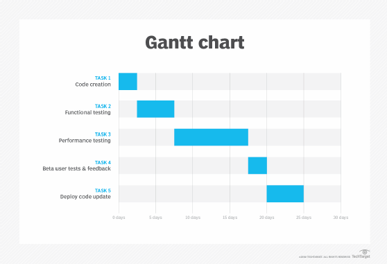
This horizontal bar chart displays tasks, or events, on the Y axis; they correspond to a timeline on the X axis, to show the schedule for and dependencies between aspects of an overall project. The chart's bars vary in length in accordance with how long the team estimates that task will take. For example, in an application update, the requirements gathering task might take longer than regression testing. Each bar's placement on the timeline provides start dates and deadlines.
Gantt charts show where tasks overlap, and where some team members will wait for new work while others complete a step, which can help prevent inefficiencies. However, these charts can get complex and long, especially when a project includes many discrete tasks.
Agile project managers can select Gantt chart builders, such as TeamGantt or GanttProject, and use plugins to bring these charts into collaboration platforms like Atlassian Jira. Dynamic Gantt charts include progress bars, critical path visualization and other features.
PERT chart
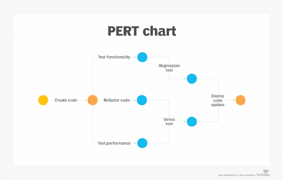
The acronym PERT stands for Program Evaluation Review Technique. A PERT chart is not strictly linear like a Gantt chart. Instead, nodes -- typically a basic shape like a circle -- represent milestones in the project. Vectors, which are connecting lines, represent the tasks to achieve them.
A PERT chart shows dependencies with a sequence of lines, and tasks that must occur at the same stage in the project with parallel lines. For example, development followed by unit testing are sequential tasks, while parallel tasks might be user acceptance testing and marketing materials creation. The PERT chart should include indicators of the sequence of tasks and estimated time to reach each milestone.
Like a Gantt chart, a PERT chart can include the project's critical path and other features. While PERT charts show task sequences at a glance, they aren't simple to construct, and adopters should learn time estimation methods and ways to track resources assigned to tasks. Software development project managers can generate PERT charts in visualization tools, such as Lucidchart and Microsoft Visio, and integrate these charts with collaboration tools like Slack.
Critical path analysis chart
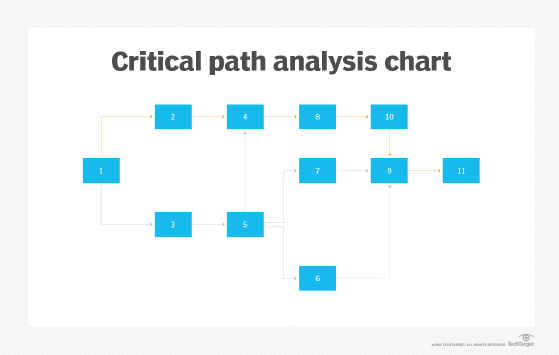
A project manager can isolate the critical path rather than generate it within a Gantt or PERT chart, or focus on the CPM within one of these methods. The critical path models all of the required activities for the project, and the longest estimated duration of tasks and events to complete it -- plus unused time called float. In a simplified example, a software update comprises development, testing and deployment phases. The project manager estimates that development takes three to five days, testing one to two, and deployment one. The critical path is eight days, with each phase dependent on the completion of the one before it. However, some testing can occur concurrently with development, and automation tools might shrink the time taken at each phase. Therefore, while the initial critical path is eight days, with judicious planning and resource deployment, it can be shortened to four or five.
A critical path analysis chart shows where tasks overlap or occur in parallel, and where duration varies, as well as high and low estimates of time. These charts also display additional information, such as activities that can branch off of the critical path.
Burn down chart
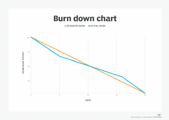
A burn down chart enables the team to visualize the progress on a project. A burn down chart includes work remaining on the Y axis against a timeline of the project on the X axis. Depending on the project, these charts can measure work as user stories, tasks, backlogs or other metrics.
A burn down chart differs from Gantt and PERT charts because it does not show relationships between tasks or working groups. Instead, it is a simple measure to indicate how close a project is to completion. A burn up chart shows work completed rather than work remaining. Both charts can include details like task completion dates, estimated vs. actual work and changes in total work during the project.
Work breakdown structure chart
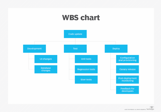
A work breakdown structure (WBS) is a hierarchical list of the tasks necessary to complete a project -- from the most general components to detailed subcomponents. The WBS is a useful way to determine assignments for teams, right down to the individual developer and tester. A WBS also clarifies the scope of a project at a high or granular level, depending on the user's interest and involvement. Teams can use a WBS as a reference guide to isolate and troubleshoot project problems.
The WBS enables a team to estimate time and/or cost for each task, then tally the numbers to arrive at an overall project estimation. The chart resembles the layout of a family tree, with the project at the root and splitting branches from it into smaller and smaller components. As such, it is neither useful as a timeline to see the interdependencies of tasks, nor for scheduling overlapping tasks. A WBS can form the basis of other project planning charts, such as a Gantt chart.
Big visible charts
Big visible charts are not rigidly structured like Gantt and PERT charts. Instead, the big visible chart is a concept in Agile collaboration that emphasizes the usefulness of quick project visualizations.
A big visual chart should display information that matters to the team in a simple and intuitive format, e.g., green status for completed tasks and red for incomplete ones. It should be prominent for easy reference, always up to date and ideally hand-drawn -- not computer-generated. Collocated Agile teams can display burn down and other big visible charts on the wall or on a prominent screen. Distributed teams should work to implement virtual approximations, such as charts embedded in the shared project dashboard and a whiteboard that's on-screen during virtual meetings.


