How to measure test progress: Every picture tells a story
Seeing the big picture when it comes managing the progress of your software tests may require putting together all the little picture pieces.
There are two key questions that all test managers need answers to: What is the current state of a test project? And how much more testing do you need to do? Creating a dashboard that uses charts and graphs to measure test progress can help answer those questions accurately. And your dashboard will also provide fast answers when management comes asking how things are going.
In my experience, test managers rely too heavily on defect rates to track progress of test projects. Defect numbers are important but they don't tell the whole story. To create a big picture of how a test project is moving along, test managers should measure and report:
- How specific features of the software are progressing through the test process;
- The number of tests planned in relationship to the number of tests run and the number of tests passed;
- The fault feedback ratio (FFR) -- the ratio of bad fixes to all the fixes -- in relationship to defects closed; and
- Cumulative defect trends, in relationship to new defects found, and defects closed.
In this article, I show you four sample charts and graphs to add to your test Dashboard. I explain why each of these measurements matters -- and how together they paint the big picture of how your test project is progressing.
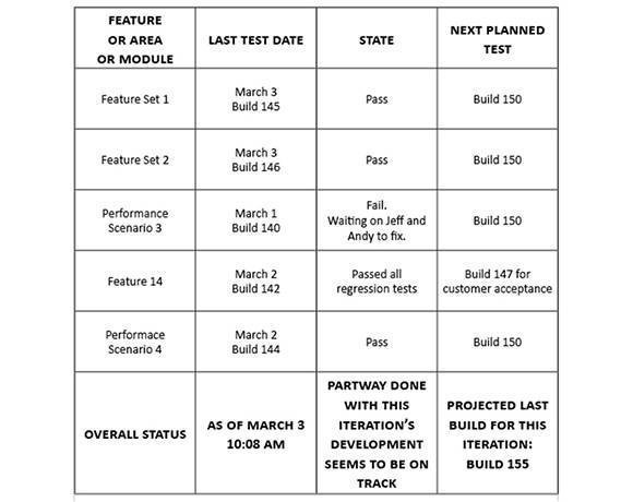
To answer the question, when will the testing be done, I came up with the dashboard shown in Figure 1. It lists product features and performance scenarios, gives their current status and indicates when the status might change again. This dashboard is organized around different features of the project. If you work by modules or areas, you can organize your chart around those. But I recommend features, because they more accurately describe what customers actually use or buy. If you use release criteria, such as performance scenarios, you could also track those too, as shown in the left-most column. Now you have a test dashboard that tracks what customers use and what you care about for the release.
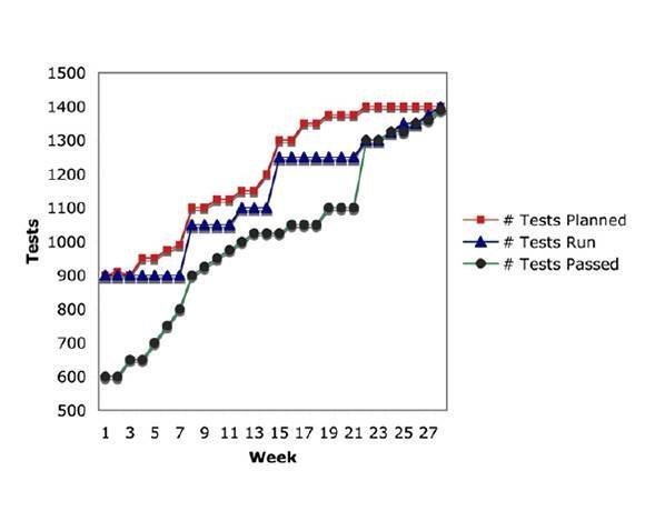
Another key metric is how much progress the testers are making over time. You can't just measure the number of test cases completed, because single-dimension measurements are way too easy to game. But if you measure several dimensions -- number of test cases planned, number of tests cases run and number of test cases passed -- you have a more complete story to tell, as shown in Figure 2. In this graph, the number of tests planned increased late in the release because the number of requirements increased late in the process. The reason why the number of tests passed was so low at the beginning of the measurement period is that the developers didn't think it was important to pay attention to the reported regressions. Also notice that the tests run measurement hit several plateaus. This was because testers were uncovering new defects as fast as the developers were finding and fixing earlier defects. In other words, we were closing defects at the same rate as our tests were uncovering new defects. If we had depicted only one of these measures, our graph would not have told the whole story.
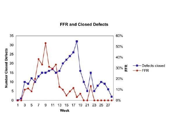
In addition to tracking progress of the testers, you should also measure how developers are doing. (You may have to work with a project manager to get this information for your dashboard.) I like to measure the fault feedback ratio (FFR), along with requirements changes, to see if developers are making any progress. They might be paddling as fast as they can just to keep up. The FFR is the ratio of bad fixes to all the fixes. You want to keep that ratio under 8 percent. In my experience, if the FFR starts to climb above that level, developers are frantic, and they are not making progress. But when the FFR goes down, developers make progress and close more defects, as shown in Figure 3.
I have seen situations where management misuses a graph like this to blame developers when a test project isn't progressing fast enough. If that's likely to happen in your organization, don't include this graph in your public dashboard.
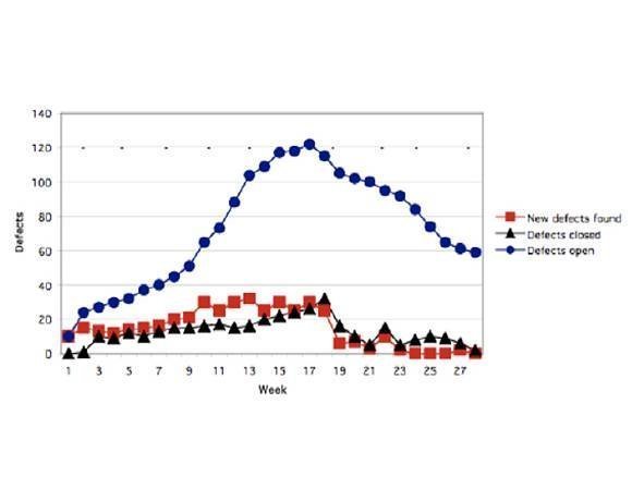
Figure 4 illustrates a complete snapshot of defects over time. I don't believe in looking at only one category of defects, such as critical or urgent. In my experience, all customers believe the defect they have encountered is the most critical. And, if you start tracking critical or urgent, your defect triage meetings start taking forever. What's important is the total number of defects. Keep in mind, too, that if you track only the number you open in a week, or the number you close in a week, you don't see the total impact of all of the defects.
More information on managing software testing projects
Learn about the software test manager's role.
Find ways to reduce testing costs but keep software quality.
Discover the strengths of static analysis in software testing.
Note that for the product we tracked in Figure 4, we never found more than 20 defects in a week. We most often found between fewer than 20, and we fixed almost as many as we found. When the top managers realized we had over 100 open defects, they were surprised and shocked. The cumulative number of all the remaining open defects was a surprise. Imagine how surprised they would be if we hadn't been fixing almost as many as we'd found each week.
To explain when testing will be done, you might decide you need to track some other data relating to changes in requirements. If the requirements keep changing, the testing will never be done.
Decide what data you need to gather for your big picture.
About the author:
Johanna Rothman is the author of Manage Your Project Portfolio: Increase Your Capacity and Finish More Projects and the Jolt Productivity award-winning Manage It! Your Guide to Modern, Pragmatic Project Management. Her upcoming book about Agile program management, Agile and Lean Program Management: Collaborating Across the Organization, will be available on leanpub.com. You can read more of her writing and blogs at jrothman.com.


