olly - Fotolia
UX vs. UI design: It's complicated but important to understand
User experience is tied to user interface, but they're not the same thing in software design. Expert Jason Grant offers his take on how to use both to make better software.
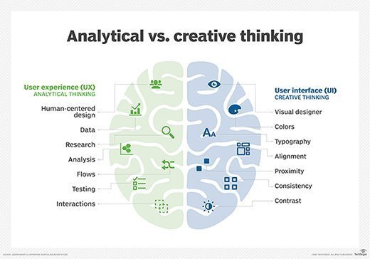
To understand UX vs. UI design, let's relate the process of designing software to building a house. When building a house, the architect helps define the size and shape of the spaces, which determines the holistic way one will experience the house. Once space, location and overall shape decisions have been made, the interior designer works on realizing the homeowner's aesthetic by making small tweaks to the shape, while determining the look and feel of each room. The architect is defining the user experience of the house, the interior designer is creating the user interface for each room and the homeowner represents the needs and desires of users.
Both the architect and interior designer are responsible for ensuring the house meets the needs and expectations of the homeowner, but also, getting early input from the contractor can ensure that the home is both buildable and within the budget. It shouldn't be UX vs. UI design; we should strive to have a collaborative effort among UX, UI and developers to create solutions that support both user and business needs.
While there are differences in UX vs. UI design, one must put equal effort into each to create intuitive, easy to use and aesthetically appealing applications. UX without UI would be a house that has the right layout and number of rooms but is horribly outdated or run-down. UI without UX would be a beautiful modern, open loft studio but would not meet the needs of a large family. When it stops being UX vs. UI design, when all elements come together and the right mix of both is achieved, then the perfect home can be realized.

Facets of UX vs. UI design
The primary aspects of user experience are summed up by UX thought leader Peter Morville. His honeycomb diagram and seven facets describe how users judge your software on whether it is useful, usable, desirable, findable, accessible, credible and valuable.

Useful
For software to be useful, it needs to serve a practical purpose that addresses needs and goals. For example, having aspirin will be very useful to someone with a headache but less useful to someone with a wound.
Usable
usability is an important aspect, but it is very ambiguous and, alone, is not sufficient to have a great experience. Iterating between design and testing allows one to understand when the pinnacle of usability has been reached.
Desirable
Aesthetic design creates emotion for a product. Positive emotion makes the product more desirable, which is why brand name companies invest highly in branding.
Findable
Users will abandon a product if they cannot quickly find what they are looking for or become extremely frustrated if they keep looking. The site and its content need to be easily found, have intuitive navigation and provide relevant results when searching.
Accessible
Forget UX vs. UI design for a moment, and remember that one in seven people worldwide require inclusive design and all users benefit. Addressing color contrast increases readability for everyone, closed captioning allows people with hearing disabilities to watch videos, including those who are in an environment where they cannot play audio, and coding best practices allow for screen readers to function effectively. Accessibility is critical to UX.
Credible
Users must trust and believe the content provided in order to deliver great UX vs. UI design.
Valuable
If the other six facets are achieved, the business value of the software should be easily addressed with customers, revenue, retention, satisfaction or one of many other goals. If the user sees value, the business realizes its goals.


