Nmedia - Fotolia
A look inside the new Redwood Oracle UI design
The two designers who head Oracle's Redwood user experience and branding effort explain the philosophy behind the new look and share the timeline for the multi-year rollout.
Redwood represents an effort to develop a new Oracle UI and reshape the company's image through graphic design.
Oracle rolled out the first pieces of its new user experience (UX), branding and marketing design at Oracle OpenWorld in September.
Hillel Cooperman and Jenny Lam, who lead the effort, did similar work in the Windows group at Microsoft before co-founding Jackson Fish Market, a Seattle design firm. Cooperman is Oracle senior vice president of user experience design and Lam is senior vice president of brand user experience design.
In this Q&A, they discuss the goals for Redwood, the philosophy behind the Oracle UI redesign, how the rollout is going and what it's like to lead change at Oracle.
What lessons from Microsoft have you brought to Oracle UI design?
Jenny Lam: One of the reasons that really enticed us back to the corporate world is designing at scale for lots of different users, millions of users who sit in front of your piece of software for eight hours a day, five days a week.
I like to think about the design in three aspects of storytelling. It's a cohesive, coherent experience, not just in the product, but from every touchpoint whether it's at the sales level, the website, the marketing, support, all the way down to the micro interactions you have with the actual software.
The rulemaking part is something that we learned a lot about working on Windows. It's like thinking at a systemic level.
The last part is the tastemaking, and that's the part that I'm really enjoying the most right now, because it was such a big difference from our previous language. The Oracle design language didn't really reflect the power and the emotion and the unique story that we need to tell.
Hillel Cooperman: It is incredibly rare to find a company of this scale who has decided to make design one of the primary differentiators between their products and the competition. Not to say Microsoft didn't care; they did. It was important, but not the way Oracle -- just from my perspective -- has bet on it.
Other ERP vendors have made similar efforts, such as Infor with its in-house design firm, Hook & Loop, and SAP with its Fiori UX. Did you look at what others did in UI design?
 Hillel Cooperman
Cooperman: We are very well versed in just about every large-scale design system that's out there. [Google] Material Design, Fluid [Framework] or Fluent [Design System] -- depending on where Microsoft is headed -- [Salesforce] Lightning [Design System] and Fiori. Oracle has had a design system as well, called Alta.
What Jenny and I were excited about was the opportunity to take a look at all of them and say, how do we move the ball forward?
Evolution happens as a step function: Things stay the same for a while, and suddenly there's a big leap. In our industry … I think we had our disruption years and years ago, and for the last while things have been kind of plateaued.
Do you use scalable design tools to propagate the Redwood design and new Oracle UI throughout the company?
Cooperman: I'll give you two examples. We have [Oracle Content and Experience Cloud] that does really sophisticated digital asset management that we're working with to be able to distribute assets across the organization, and to deliver really personalized and nuanced storytelling in the Redwood style and using the Redwood design language to our customers.
On the product UI side, we're using a tool called Visual Builder, which is our development tool that we use to build our own products and that our customers use to build extensions.
When you were in discussions about working at Oracle, did you express a desire to maintain the personal touch you had at your design firm?
Cooperman: Yes. I was skeptical -- healthfully skeptical. Every senior leader Jenny and I talked to assured us that this is what they wanted. I just hadn't really experienced that level of commitment to this caliber of work before.
The skepticism was not anything to do with Oracle. The skepticism was [from] a history of working in the industry and knowing that this stuff is hard. It's hard to make a commitment to this caliber of work and stick to it, because it fundamentally means evolving your culture.
 Jenny Lam
Lam: Hillel and I say often that this is not a designer-led effort. It's a design-led effort. That means a commitment to user centricity.
Cooperman: And looking at them as a whole human being -- focusing, yes, on the functionality and the accessibility and the intuitiveness and making sure it does the thing they want, and it does it efficiently and effectively and well. But it also means dealing with them as humans -- the head and the heart -- and making sure that they walk away from using our products, our services and their relationship with Oracle feeling really good about it.
What kinds of complaints have you heard about the Oracle UI from customers?
Cooperman: We spend a lot of time with customers, seeing things in action, and together seeing opportunities for improvement, where they say, 'This is pretty good, but I'm still having this problem in [Oracle HCM Cloud] in how I want to visualize my employees or the kind of analytics that I want to do or in the time it takes me to do this particular business process.'
Every customer that we talked to, even when we're selling, we say to them: This is a relationship. This is not a product that you're buying. This is a relationship that you're investing in, and we're going to need you to be a full partner with us to constantly give us feedback so there's constant improvement in the user experience.
What tools do you use to test people's reactions to the Oracle UI? Do you do things like track eye movement?
Cooperman: We certainly can use eye-tracking devices [and] we're now in a place where we have more sophisticated things we can use, for example, sentiment analysis face tracking, where we're able to understand how someone is feeling as they use our software. To validate it, we put users through an intentionally irritating flow, not one that we've ever shipped to a customer. We designed it specifically for the purpose of bugging them to validate the fact that the face tracking software was effectively reflecting their emotional state.

What are the essential elements of Redwood?
Cooperman: Search and conversation. The notion that you should be able to say to the technology what you want, in the way you think about it, and have the technology understand and adapt to you, as opposed to the way it's been for decades … where you have to learn the way the technology thinks about the function, and you have to adapt yourself as a user to the technology.
Another element is tasks: the notion that we don't go to interact with a feature or an app, but that we have a task in mind.
We look at integration as a serious competitive advantage. We believe that both the horizontal and vertical integration -- the more Oracle you have -- the better it all works together, and that we integrate from the bottom of the stack to the very surface of the user interface. Those are fundamental. And then finally, the aesthetics that connect with people emotionally.
Lam: From an aesthetic perspective, it's really not about hitting it with a 'pretty stick.' It's about marrying that intelligence to that aspiration, or the interaction of experience with a presentation layer that conveys those values.
One of the values that we felt we needed to convey in our language is about a global principle … but our design language … with the red and the black and the white was very North American and almost Californian.
There's also a human element to it. People are the center of everything that we do, and the visuals should reflect the human touch. Some of the signs [at OpenWorld] were supposed to convey data, but they were hand done and inspired by world art.
How did you come up with the name Redwood?
Cooperman: We wanted something that was evocative of the values [and] the sophistication of the redwood root system that is collaborative and supports these incredible, amazing living things. We wanted something that felt more organic and human [and] was evocative of our history and our legacy: Our headquarters are in Redwood City, and the color red [in the Oracle logo and graphics]. And we liked Redwood because redwoods reach up into the clouds.

What's the timeline?
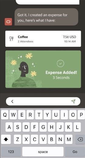
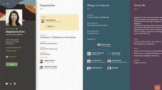
Cooperman: OpenWorld was a fundamental redesign. The front door of our website has been fundamentally redesigned. There are a lot of internal tools we've redesigned just to get everyone headed in the right direction.
The first bits of Redwood product user interfaces are coming in 2020. And we'll touch a percentage of our customers to start, in the CX space, in the HCM space and in the ERP space.
In a blog post, Hillel wrote that designers don't create the user experience, company cultures create user experience. How are you changing the culture?
Cooperman: The most important thing that Jenny and I try to focus on are positivity and vulnerability. It's saying that by being positive about the change we want to achieve, by being vulnerable about the fact that we're just human beings doing our best and showing that it's okay, it's a safe place to do your best -- which sometimes means not getting to where you want to be and you got to try multiple times.
Lam: From a design perspective … just doing the work, showing up and doing excellent work, I think that has been the most effective way that we're also not only showing what's possible, but liberating folks to not always follow the rules, to experiment and to reach further.
How is the cultural change going?
Lam: We were really humbled by the reception, especially at OpenWorld. Even the words which we used on stage and the tone of voice were different, and you got a lot of responses from internal folks. In fact, those are the ones that I think impact us the most: the internal voice and how it's affected them and their work.
Cooperman: In tech companies, there can be challenges around people who are more engineering oriented or people who are more sales oriented, and who may not place as much of a priority on the way that design and this kind of customer focus can really bring everything together. What we've encountered is openness, collaborative-ness, positivity. They've been nothing but welcoming, and frankly, quite patient with us. … It's been a delightful experience.


