The psychology of UX design: How design affects CX
In her book, '100 Things Every Designer Needs to Know About People, 2nd Edition,' Susan Weinschenk explains how UX design relies on psychology to improve customer experiences.
In the past, organizations aimed to create the highest quality product on the market, but now, people also expect exceptional customer experiences when they interact with those businesses. Companies must understand the psychology of UX design, which helps create optimal digital experiences to engage customers.
If organizations want to maintain revenue and customers, they should design products and services well from the customer's point of view, said Susan Weinschenk, author of the book 100 Things Every Designer Needs to Know About People, 2nd Edition.
In her book, Weinschenk uses her background in psychology and consulting to break down the human traits that organizations must consider when designing their products or services. By understanding how people respond to details such as font size or patterns on a screen, or what types of topics or images motivate people to click on a webpage, the designer can better create experiences with the customer in mind and exceed customer expectations.
The following is an excerpt from Chapter 1 of 100 Things Every Designer Needs to Know About People, where Weinschenk explains how people look at a webpage so designers can understand the most effective way to choose what content goes on a page and where to put it. Vision affects how people perceive stories and how the brain uses images to make sense of what is happening around them.
Throughout the book, Weinschenk addresses more than just how the audience sees; she also dives into how people read, how they focus their attention and how they feel, which all contribute to understanding how people will react to and interact with a product or experience.
How people see
Vision trumps all the senses. Half of the brain's resources are dedicated to seeing and interpreting what we see. What our eyes physically perceive is only one part of the story. The images coming in to our brains are changed and interpreted. It's really our brains that are "seeing."
What you see isn't what your brain gets
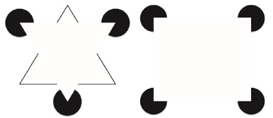
You think that as you're walking around looking at the world, your eyes are sending information to your brain, which processes it and gives you a realistic experience of "what's out there." But the truth is that what your brain comes up with isn't exactly what your eyes are seeing. Your brain is constantly interpreting everything you see. Take a look at Figure 1.1, for example.
What do you see? At first you probably see a triangle with a black border in the background and an upside-down white triangle on top of it. Of course, that's not really what's there, is it? In reality there are merely lines and partial circles. Your brain creates the shape of an upside-down triangle out of empty space, because that's what it expects to see. This particular illusion is called a Kanizsa triangle, named for the Italian psychologist Gaetano Kanizsa, who developed it in 1955. Now look at Figure 1.2, which creates a similar illusion with a rectangle.

The brain creates shortcuts
Your brain creates these shortcuts in order to quickly make sense out of the world around you. Your brain receives millions of sensory inputs every second (the estimate is 40 million), and it's trying to make sense of all of that input. It uses rules of thumb, based on past experience, to make guesses about what you see. Most of the time that works, but sometimes it causes errors.
You can influence what people see, or think they see, by the use of shapes and colors. Figure 1.3 shows how color can draw attention to one message over another.

If you need to see in the dark, don't look straight ahead
The eye has 7 million cones that are sensitive to bright light and 125 million rods that are sensitive to low light. The cones are in the fovea (central area of vision), and the rods are less central. So if you're in low light, you'll see better if you don't look right at the area you're trying to see.
Optical illusions show us the errors
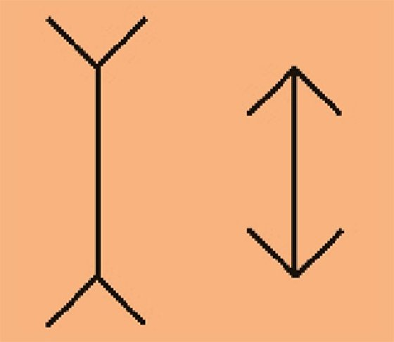
Optical illusions are examples of how the brain misinterprets what the eyes see. For example, in Figure 1.4 the line on the left looks longer than the line on the right, but they're actually the same length. Named for Franz Müller-Lyer, who created it in 1889, this is one of the oldest optical illusions.

We see in 2D, not 3D
Light rays enter the eye through the cornea and lens. The lens focuses an image on the retina. On the retina it is always a two-dimensional representation, even if it is a three dimensional object. This image is sent to the visual cortex in the brain, and that's where recognition of patterns takes place—for example, "Oh, I recognize that as a door." The visual cortex turns the 2D image into a 3D representation.
Takeaways
- What you think people are going to see when you design a product may or may not be what they actually see. What people see might depend on their background, knowledge, familiarity with what they are looking at, and expectations.
- You might be able to persuade people to see things in a certain way, depending on how you present information and visual elements. You can use shading or colors to make it look like some things go together and others don't.
https://www.forbes.com/sites/forbestechcouncil/2019/06/05/for-a-great-user-interface-focus-on-these-seven-design-aspects/?sh=fec972467a81
 Purchase your copy of


