
Fotolia
Ten KPI templates for your dashboards
KPIs help companies gauge success, but how do you choose the right metrics to create useful reports? Here you'll find 10 KPI examples to inspire your executive dashboards.
Key performance indicators provide measurable value that companies can use to determine whether they are achieving business goals. Business leaders must define KPIs based on what they need to track, and then use enterprise reporting or self-service BI tools to gain insight into performance against those metrics. Operational KPIs are typically tracked daily using real-time BI data, while strategic ones are monitored at various intervals: weekly, monthly, quarterly and so on.
In this excerpt from David Parmenter's Key Performance Indicators: Developing, Implementing, and Using Winning KPIs, you'll find several examples of KPI templates you can use for executive dashboards and balanced scorecards, as well as two dashboards that contain sample KPI reports.
The KPI examples include customer satisfaction, employee satisfaction, the value of new business, net profit before tax, return on capital employed, cash flow, expenses as a ratio to revenue, health and safety, manufacturing capacity and operational efficiency.
Click the images below to see how KPI templates are designed so you can apply these practices to build your own dashboards for KPI tracking and reporting.
Chapter 5
Templates for Reporting Performance Measures
The reporting framework must accommodate the requirements of different levels in the organization and the reporting frequency that supports timely decision making. This chapter presents some better-practice formats that will help speed up this vital step.
This chapter should be read in conjunction with the white papers and books written by Stephen Few.
Reporting Key Result Indicators in a Dashboard to the Board
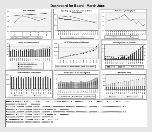
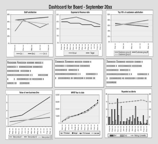
A dashboard should be a one-page display, such as the examples in Exhibits 5.1 and 5.2. The commentary should be included on this page.
A good dashboard with the key result indicators (KRIs) going in the right direction will give the board confidence that management knows what it is doing and that the ship is being steered in the right direction. The board can then concentrate on what it does best: focusing on the horizon for icebergs in the first-class lounge instead of parking themselves on the ship's bridge and getting in the way of the captain, who is trying to perform the important day-to-day duties. Ten examples of KRI board dashboard graphs can be found in Exhibit 5.3.
Customer Satisfaction
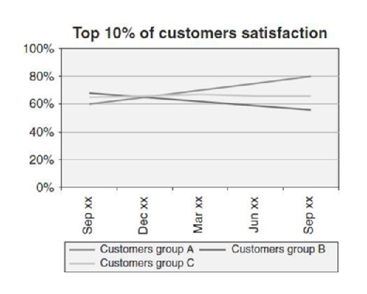
Customer satisfaction needs to be measured at least every three months by using statistical samples and focusing on your top 10% to 20% of customers (the ones that are generating most if not all of your bottom line). This process does not need to be overly expensive. If you think once a year is adequate for customer satisfaction, stick to running a sports club; you are not safe in the public or private sectors.
Employee Satisfaction
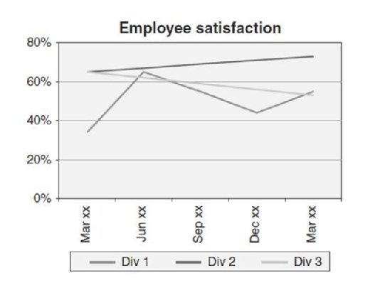
This is no different or less important than customer satisfaction. As one person said, "Happy staff make happy customers, who make happy owners." If you believe in this connection, run a survey now! A staff satisfaction survey need not be expensive and should never be done covering all staff; instead, it should be replaced by a rolling survey with a vertical and horizontal slice of the management and staff.
Value of New Business
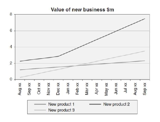
All businesses in the private sector need to focus on the growth of their rising-star products. It is important to monitor the pickup of this new business, especially among the top 10% to 20% of customers, who create most of the bottom line.
Net Profit before Tax
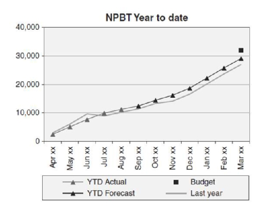
Since the board will always have a focus on the year-end, it is worthwhile to show the cumulative net profit before tax (NPBT). This graph will include the most recent forecast that should be updated on a quarterly basis bottom-up. This is the only KRI graph that starts at the beginning of the year; the rest should show a rolling 15- to 18-month trend.
Return on Capital Employed
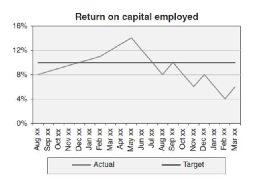
Return on capital employed (ROCE) is the old stalwart of reporting. The difference now is that ROCE is no longer a key performance indicator (KPI) but a key result indicator (KRI). This graph needs to be a 15- to 20-month trend graph.
Cash Flow
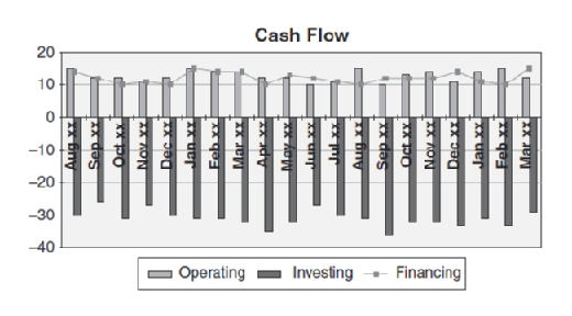
The cash flow graph goes back at least 12 months and should be projected out at least 6 months forward.
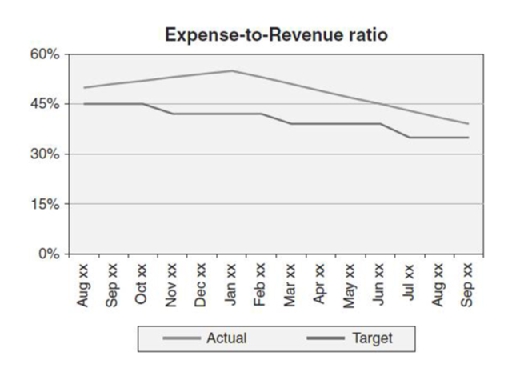
Expenses as a Ratio to Revenue
The board should be interested in how effective the organization has been in utilizing technology and continuous improvement to ensure that cost of operations is tracking well against revenue.
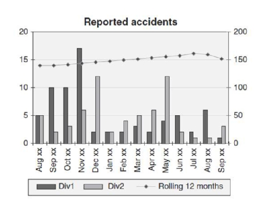
Health and Safety
All boards are interested in health and safety; the well-being of staff is a much higher priority these days than it was in the past.
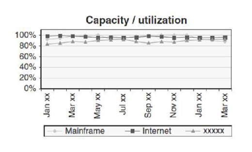
Capacity
Monitoring the capacity of key machines and plants should go forward at least 5 to 12 months. The board needs to be aware of capacity limitations, and such a graph will help focus board members on new capital expenditure requirements.
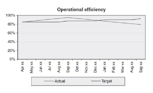
Operational Efficiency
Operational efficiency is a composite index based on a variety of statistics, such as delivered in full on time, portion of idle machine time (measuring key machines only), and the like.
Copyright info
More on transaction management and operations:
- Continue to the next section: Creating key performance indicator (KPI) reports and dashboard design.
- Download a free PDF of this chapter: Key Performance Indicators: Developing, Implementing, and Using Winning KPIs.
- To purchase this book or similar titles, visit Amazon.com.


