Fotolia
Choosing the best visualization tools for big data analytics
Data-driven enterprises use visualization tools to tell the stories hidden in big data -- stories which help users turn information into profit. Here's how to choose the right tool.
Visualization tools for big data analytics do far more than just paint pretty pictures. These platforms quickly recognize patterns in data and surface important information in an easy-to-digest way -- despite the fact that big data and visualization are on the opposite ends of the spectrum in terms of their inherent characteristics and functional applications.
"Big data, on one hand, is about assimilating and aggregating breadth of data across different spectrums, whereas visualizations are distilled to provide crisp, focused and structured insights on demand," said Naresh Agarwal, head of data and analytics at Brillio, a digital technology consulting firm.
The types of employees who can utilize these tools also span the spectrum, from technical data scientists to nontechnical, line-of-business users. Traditional data warehousing initiatives were, in large part, managed by enterprise IT teams, whereas the big data revolution is driven primarily by business stakeholders that view data as an asset to improve their business functions. With that, the big data landscape in recent years has focused on sourcing and integrating these data sets for downstream use.
"As this ecosystem has matured, development in the front-end layer, where the transformation from data to human-consumable insight takes place, has now taken center stage," said Nitin Bajaj, director of business intelligence (BI) and analytics for NTT DATA Services.
Popular visualization tools for big data
There are a number of tools to choose from, depending on the use case, but the big trend over the last five to 10 years has been to move away from enterprise-wide, IT-developed software and more toward self-service analytics developed and maintained by business analysts, said Dan Gastineau, practice leader for visual analytics at Aspirent, a management consulting firm focused on analytics.
Look for the ability to filter, slice and dice data in ways that enable interactive analysis on big data at speeds that make it possible for users to delve into huge volumes of data and get answers to their questions immediately, advised Pratik Jain, technical architect at Kyvos Insights, a big data analytics platform provider. Also, visualization tools for big data analytics should provide enough collaboration features that enable easy sharing of insights, both within, as well as outside, the organization, he said.
"A tool is considered good if it provides graphical and visual elements that can represent a wide variety of data appropriately and help the human mind picture and comprehend their big data effortlessly," Jain said.
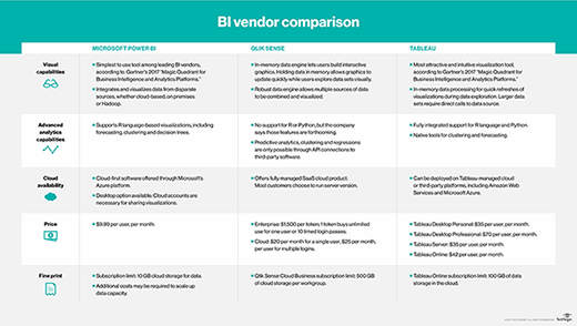
The three dominant BI and visualization players are Tableau, Qlik Sense and Microsoft's Power BI. They each have their idiosyncrasies, but they largely compete for the same segment of users.

Power BI has the advantage of syncing well with Azure, Microsoft's cloud environment, and it is included in the Office suite, which means it adds no incremental cost for most businesses.
Qlik's strength is its ability to blend and shape data from multiple sources, and as a web-based platform, it avoids the hassle of managing desktop applications for multiple users.
Tableau is the market leader and by far the most mature in its execution of front-end visuals. Development takes place in a desktop application, but it also has a web-based platform for distributing dashboards to end users.

Some other popular visualization tools for big data include:
- Sisense provides tools for preparing and exploring data from multiple sources.
- Datawrapper is an interactive tool for creating charts and maps without coding.
- Dash by Plotly embeds visual analytics on websites and dashboards.
- D3.js is a JavaScript tool for visualizing data using web browsers.
- Google Charts simplifies the process of creating interactive charts for web and mobile apps.
- Kibana is an open source visualization tool for Elasticsearch data.
- Domo offers BI and data visualization for many different types of users and industries.
- Shiny uses R to develop interactive web apps.
Focus on data-driven communication
Experts recommend keeping an open mind when choosing a data visualization tool, as researchers constantly find new ways to extract value from big data.
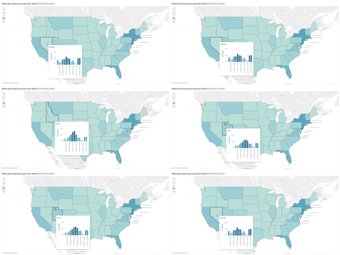
One such example is Vega -- a "visualization grammar" project spearheaded by Jeff Heer of the University of Washington. Vega is a new favorite of Aaron Kalb, vice president of design and strategic initiatives at Alation, a data cataloging tool for collaboration, in part because it enables people at different levels of technical know-how and with different amounts of time on their hands to easily construct interactive visualizations.
With big, multidimensional data sets, it's harder than ever to show what the data says simply with static images or even dashboards where changing parameters require reloads. Using tools like Vega, individuals can readily show how the data changes over time, as users poke, prod and slide around it, removing outliers or traversing across time or space without huge teams of developers.
At the end of the day, enterprise visualization tools for big data analytics have more to do with improving communication about data than producing a shiny new chart. The smartest organizations are looking at how these tools can encourage collaboration across diverse people with different skills and specialties to turn data into action. This may involve bringing together folks with expertise in visualization tools, human perception and psychology, design and layout, and business.
"It's really a communication exercise and requires putting together the right colors and shapes with the right labels, titles, context, preamble and business environment to be impactful," Kalb said.


